Saas branding
A branded startup website concept focused on clarity, credibility, and conversion across the user journey.

This rebrand for Silktide focused on evolving the company's visual identity to better reflect its position as a leading platform for web accessibility, website quality, and digital experience improvement.
The goal was to create a brand system that felt clearer, more confident, and more modern while supporting Silktide's reputation for helping organizations improve accessibility, content quality, SEO, privacy, and overall website performance. The result was a refreshed visual direction designed to feel credible, distinctive, and adaptable across the website, product marketing, and wider brand communications.
Brand Audit & Concepts
We began by reviewing Silktide's existing identity, market positioning, and digital presence, then explored a range of visual concepts to define a clearer and more modern brand direction.
Refinement & System Design
From the strongest concept, we refined the logo, color palette, typography, and supporting brand elements into a cohesive identity system that could work consistently across digital touchpoints.
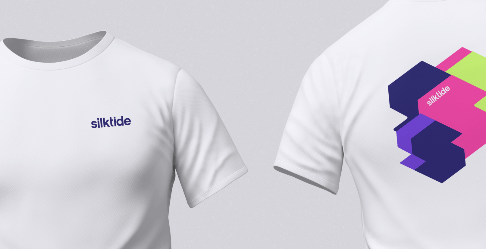
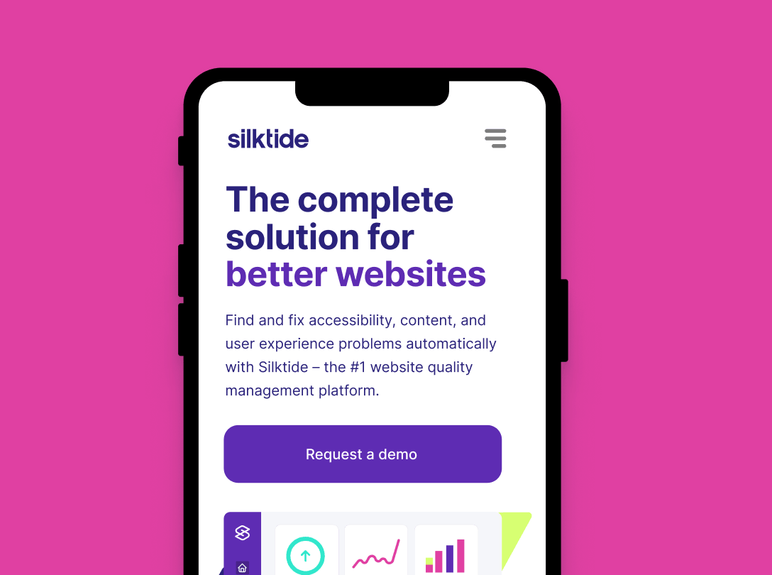
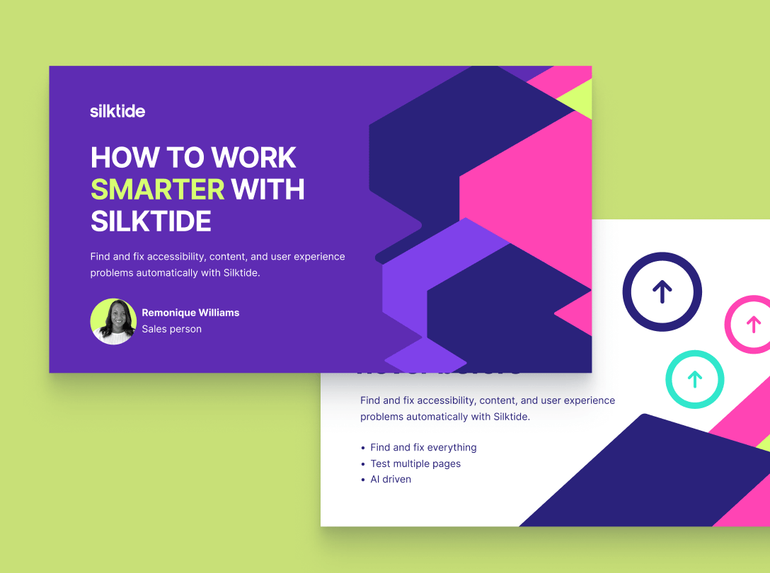
Application & Final Branding
The final stage focused on applying the new brand across web layouts, campaign assets, and marketing materials, ensuring the identity felt polished, scalable, and unmistakably Silktide in every context.